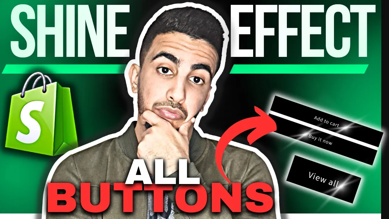
Benefits of Adding Shine Effect Animation to All Buttons in Shopify
Implementing a soft, diagonal light sweep across every call‑to‑action unlocks a striking blend of aesthetic, experiential, and commercial advantages:
Visual Engagement Benefits
- Captures instant attention with a dynamic glint that stands out in static layouts
- Infuses buttons with premium, “glass‑like” depth—suggesting quality at a glance
- Creates rhythmic motion on scroll, keeping pages feeling lively and modern
- Elevates CTAs above surrounding elements in the visual hierarchy without enlarging them
- Provides subtle visual variation site‑wide through staggered, timed sweeps
Conversion Optimization Benefits
- Boosts click‑through rates by pairing motion cues with persuasive button copy
- Reduces bounce‑induced friction—shiny CTAs subtly invite deeper exploration per page
- Increases add‑to‑cart frequency when product and cart buttons feel more “alive”
- Encourages impulse purchases; users act sooner when the call to action feels premium and engaging
- Enhances A/B‑testing leverage—quantify lift from shine timing, speed, or repeat intervals
Design & Implementation Benefits
- Achieved with a single reusable CSS keyframe or small GSAP snippet—minimal code footprint
- Runs on GPU (transform and opacity), preserving Core Web Vitals and battery life
- Offers full customization: angle, speed, opacity, trigger (hover, autosweep, intersection)
- Integrates seamlessly across themes; one class applies to buttons in product, cart, and modal components
- Enables quick toggle for seasonal campaigns (e.g., festive color shine) without redesigning assets
CODE :
<style>
.button,.shopify-payment-button__button {

background-color: black !important;
color: white !important;
box-shadow: none;
position: relative;
z-index: 1;
overflow: hidden;

}
.button::before,
.button::after,
.button::hover, .shopify-payment-button__button::before, .shopify-payment-button__button::after, .shopify-payment-button__button::hover {
box-shadow: none !important;
}
.button:hover, .shopify-payment-button__button:hover {
transform: none !important; transition: none !important;
}

@keyframes shine {
to {
left: 100%;
}
}
#MainContent .button::after, .shopify-payment-button__button::after {
z-index: -1 !important;
position: absolute;
top: 0 !important;
left: -100%;
width: 100% !important;
height: 100% !important;
transform: skew(-15deg) !important;
--border-opacity: none;
background-image: linear-gradient(
90deg,
transparent,
rgba(255, 255, 255, 0.25),
transparent
) !important;
}
.button:hover::after, .shopify-payment-button__button:hover::after {
animation: shine 1s ease;
}
</style>