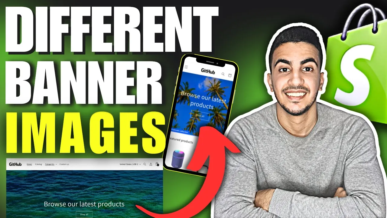
Implementing device specific banner images that swap intelligently between desktop and mobile layouts enhances visual impact, speeds up load times, and streamlines the customer journey, unlocking several strategic advantages:
Visual Optimization
• Ensures perfect composition on every screen wide, cinematic imagery for desktops and portrait friendly crops for phones.
• Keeps headline text and calls to action fully visible, avoiding awkward overlays or cut off messaging.
• Preserves focal points and brand photography quality by preventing automatic theme cropping.
• Reinforces brand consistency with pixel-sharp assets that match each device’s resolution and aspect ratio.
Performance & SEO
• Serves lighter image files to mobile, slashing page weight and improving Core Web Vitals like LCP and FID.
• Boosts mobile search rankings and Google Ads Quality Score through faster load speeds.
• Reduces data usage for shoppers on cellular networks, minimizing bounce from slow connections.
• Decreases server bandwidth costs by delivering only the asset size each device needs.
User Experience
• Delivers a polished, responsive feel banners fit naturally above the fold on any device.
• Enhances readability and accessibility, keeping text overlays legible without pinch zoom.
• Encourages longer browsing sessions as customers enjoy uncluttered, well scaled visuals.
• Aligns with touch first interaction patterns, making CTAs and carousel controls easier to tap.ì
Banner to show on Desktop only :
@media screen and (max-width: 750px) {
  .banner {
    display: none !important;
  }
}Banner to show on Mobile only :
@media screen and (min-width: 750px) {
  .banner {
    display: none !important;
  }
}